- Why Should You Focus on Improving Your Furniture Website Design?
- First Impressions Always Matters
- SEO Advantages
- UX or User Experience
- Brand Identity
- Beyond Banners: Crafting a User-Friendly Furniture Shopping Experience
- Top Furniture Website Design Examples
- Top Design Hacks for a Magnetic Furniture Website
- Put Utmost Emphasis on Mobile Responsiveness
- Focus on Simplifying Navigation
- Make Sure to Add High-Quality Imagery
- Incorporate Comprehensive Product Information
- Add Customer Reviews and Ratings
- Offer Personalization and Recommendations
- Utilize Interactive Tools
- Streamline the Checkout Procedure
- Leverage Content Marketing
- Focus on Boosting Website Speed
- Common Pitfalls to Avoid
- Wrapping Up
Are you a furniture business owner, but still do not have an effectively designed website? If yes, it is high time to focus on your furniture website design as it is something which can help you to stay competitive. In this case, you can consider choosing furniture Ecommerce website design solutions. Elsner Technologies being a leading furniture web development company knows the intricacies of designing websites that not only look stunning but also help drive conversions and engagements.
So, we, at Elsner, have come up with a comprehensive guide. Through this, we are going to share top furniture website design examples along with valuable tips with which you can improve your online presence. So, let’s dive in:
Why Should You Focus on Improving Your Furniture Website Design?
Whenever you ensure that your website is effectively designed, you will be able to attract a larger number of customers. A great design also helps to establish credibility. Below are discussed the key reasons why it is worth investing in great website design:
First Impressions Always Matters

Your website is the actual representation of your business and acts as the first point of contact with your prospective customers. Whenever you make sure that the design of your site is eye-striking and professional, it facilitates the trust-building process and helps craft a positive first impression.
SEO Advantages
 When your site is structured effectively with optimized images and content, it plays a key role in boosting your search engine rankings. Thereby, it becomes much easier for customers to discover your business online.
UX or User Experience
 A user-friendly site is known for ensuring visitors can effortlessly navigate and find what they are looking for. Ultimately, it results in greater engagement and conversion rates. If you want to attain related goals, then opting for the best furniture Ecommerce servicesis always a good idea.
Brand Identity
 Maintaining consistency in design elements like fonts, colors, and images helps reinforce your brand identity. Not only that, but it helps to make your business memorable.
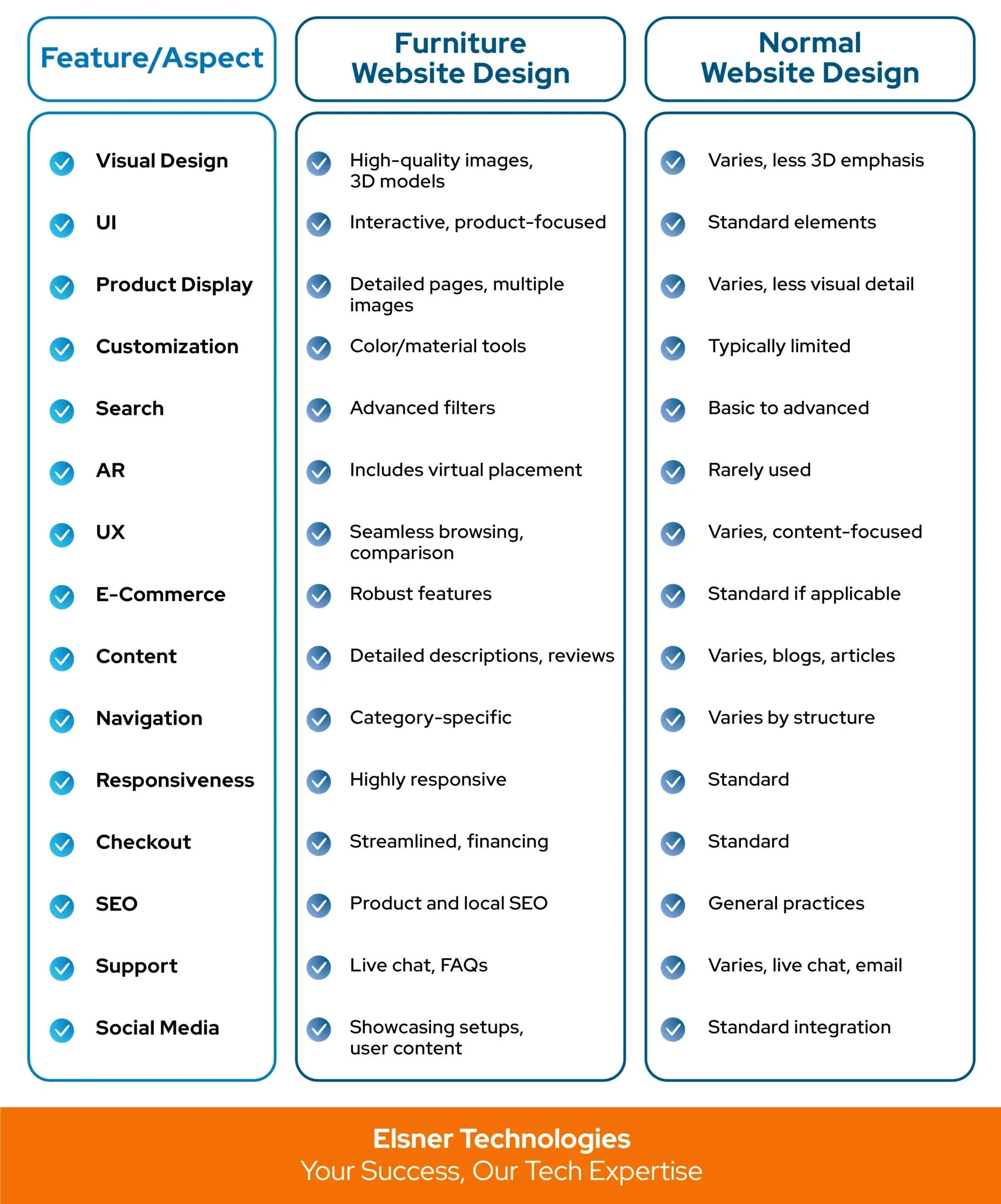
Beyond Banners: Crafting a User-Friendly Furniture Shopping Experience
Here is a comparison table highlighting the key differences between furniture website design and normal website design:

Top Furniture Website Design Examples
In the following section, we are going to discuss details about some of the best-designed furniture sites. These particular websites are known to stand out for their functionality, aesthetics, and user experience or UX:
|
Website |
Design Elements | User Experience |
Unique Features |
|
Made.com |
Clean, modern design with high-quality images. | Intuitive navigation, detailed product pages, and customer reviews. |
Interactive room planner tool. |
|
Ikea.com |
Sleek and organized design with practical user-friendliness. | Comprehensive search functionality, and categorized navigation. |
Augmented reality (AR) app. |
|
Wayfair.com |
Vibrant, engaging design with diverse product offerings. | Personalized recommendations, and detailed product descriptions. |
3D room planner, VR options. |
|
WestElm.com |
Elegant, contemporary design with high-quality visuals. | Seamless navigation, clear calls to action. |
Inspiration galleries, style guides. |
|
CB2.com |
Modern, trendy design with bold images. | User-friendly interface, and inspirational content. |
Virtual design services, design tips blog. |
|
Crate & Barrel |
Clean and sophisticated design with a focus on visuals. | Easy navigation, detailed product descriptions, and customer reviews. |
3D room planner, inspiration galleries. |
|
Restoration Hardware |
Luxurious design with high-quality images and videos. | Seamless navigation, and detailed product pages. |
Virtual showroom tours, and design services. |
|
Ashley HomeStore |
Warm and inviting design with a focus on home settings. | User-friendly navigation, detailed product descriptions, and reviews. |
Interactive room planner, AR view. |
|
Herman Miller |
Modern, minimalist design focusing on product quality. | Simple navigation, detailed product descriptions, and customer stories. |
Virtual showroom, ergonomic guides. |
|
Houzz |
Contemporary design with a focus on inspiration and products. | Personalized recommendations, and detailed product pages. |
Ideabooks, project management tools. |
Top Design Hacks for a Magnetic Furniture Website
In case you are focusing on coming up with an attractive furniture Ecommerce website design, then there are certain tips that you should follow. Here are some of the notable ones that you should definitely know about before choosing a reputed furniture web development company:
Put Utmost Emphasis on Mobile Responsiveness
Why It Matters:
As currently a large portion of web traffic comes from mobile devices, it becomes important to focus on the mobile-friendliness of your site. With this, you would be able to reach out to a wider group of audience.
How to Implement: In this regard, you can leverage different responsive design techniques to make sure that your website seamlessly adapts to various screen sizes. You can even test your website on various devices to ensure a smooth experience.
Focus on Simplifying Navigation
Why It Matters:
Whenever the navigation of your website is easy, it will let users discover what they are actually searching for and that too quickly. Thus, it facilitates improving UX or user experience and reducing bounce rates.
How to Implement: You should make sure to organize products into clear categories and subcategories. Also, it is important for you to include a search bar and filter options in order to effectively assist users narrow down their choices.
Make Sure to Add High-Quality Imagery
Why It Matters:
Furniture is a visual product, and so, incorporating high-quality images tends to play a key role. With this, you would be able to effectively display your items in order to catch the attention of people.
How to Implement: You can consider investing in professional photography. Also, you should make sure to incorporate multiple images for every product, highlighting different details and angles. Again, leveraging specific features such as Zoom and 360-degree views facilitates boosting the overall shopping experience. In this regard, you can opt for the assistance of a reliable furniture web design company.
Incorporate Comprehensive Product Information
Why It Matters:
Detailed product descriptions tend to play a key role in assisting customers so that they can make well-informed decisions. Ultimately, it helps in effectively reducing the chances of returns.
How to Implement: In this case, you should make sure to add detailed descriptions, materials, and dimensions, along with care instructions for every product. You can even make use of bullet points for easy readability.
Add Customer Reviews and Ratings
Why It Matters:
Social proof through customer reviews and ratings builds trust and influences purchasing decisions.
How to Implement: Enable product reviews and ratings on your website. Highlight positive reviews and address any negative feedback constructively.
Offer Personalization and Recommendations
Why It Matters:
Personalized experiences increase customer satisfaction and can boost sales.
How to Implement: You can use data analytics to provide personalized product recommendations based on user behavior and preferences. Along with that, it is also a good idea to highlight bestsellers and trending items.
Utilize Interactive Tools
Why It Matters:
Interactive tools like room planners and AR apps engage customers and help them visualize products in their space.
How to Implement: You can focus on integrating tools that allow customers to design their rooms and see how furniture pieces fit together. Also, you should make sure to promote these specific tools prominently on your site. Make sure to opt for the best furniture web design agency, if you are looking for related aid.
Streamline the Checkout Procedure
Why It Matters:
A smooth and straightforward checkout process plays a major role in effectively reducing cart abandonment. Along with that, it also helps in boosting the conversion rates.
How to Implement: As a part of it, you should focus on simplifying the checkout process by minimizing the number of steps and forms required. You can even offer multiple payment options and ensure a secure checkout environment.
Leverage Content Marketing
Why It Matters:
Valuable content such as blogs, guides, and videos can drive traffic to your site and help in establishing your brand as an industry authority.
How to Implement: One of the best ways to implement this particular strategy is to craft a content strategy that includes regular blog posts, how-to guides, and design inspiration. You should even focus on optimizing content for SEO in order to effectively boost the search rankings.
Focus on Boosting Website Speed
Why It Matters:
Fast-loading websites provide a better user experience and are favored by search engines.
How to Implement: You should optimize images, use efficient coding practices, and leverage content delivery networks (CDNs) to improve site speed.
Common Pitfalls to Avoid
While designing a furniture website, you should essentially be mindful of these common pitfalls:
|
Pitfall |
Description |
|
Cluttered Layout |
Avoid overwhelming visitors with too much information or too many visual elements. A clean and organized layout enhances user experience. |
|
Slow Loading Times |
Ensure your website loads quickly to prevent visitors from leaving before the page fully loads. |
|
Poor Mobile Experience |
Test your website on various mobile devices to ensure it provides a seamless experience for mobile users. |
|
Lack of Clear CTAs |
Make sure your calls to action are clear and prominently displayed to guide users towards desired actions. |
|
Neglecting SEO |
Optimize your website’s content, images, and structure for search engines to improve visibility and attract organic traffic. |
Wrapping Up
Thus, crafting a thriving furniture Ecommerce website design necessitates a careful balance of functionality, aesthetics, and UX or user experience. However, by taking inspiration from top-designed websites and following the key tips that are outlined in this blog post, you would be able to build a robust online presence that not only appears great but also drives conversions and engagement.
In this regard, one of the great ideas would be to invest in professional furniture Ecommerce services offered by a reputed agency like us. This way, you can make sure that your furniture online store meets the highest standards.

About Author
Harshal Shah - Founder & CEO of Elsner Technologies
Harshal is an accomplished leader with a vision for shaping the future of technology. His passion for innovation and commitment to delivering cutting-edge solutions has driven him to spearhead successful ventures. With a strong focus on growth and customer-centric strategies, Harshal continues to inspire and lead teams to achieve remarkable results.


