- Introducing the latest Hyvä UI release post version 1.0! It’s here and ready to elevate your experience.
- What elements comprise the Hyvä UI component library?
- Hyvä UI Comes with a Figma file
- Our Top 8 Picks From the Hyvä UI Library
- 1. Headers
- 1. Clean
- 2. Compact
- 3. Stacked
- 2. Menu
- 1. Simple static links
- 2. 4-column mega menu
- 3. Vertical dropout 4 column
- 3. Footers
- 1. Clean
- 2. 4 Column Newsletter
- 3. Mega
- 4. Product Listing Page (PLP)
- 5. Product Category Page (PCP)
- Grid images
- Grid Patterns
- 6. Generic Content
- 7. Attention grabbers
- 8. CTA
- Conclusion
Hyvä UI is an incredible toolkit filled with ready-to-use components that seamlessly integrate with Hyvä Themes. This means creating in Hyvä becomes even more streamlined, quicker, and enjoyable! With Hyvä UI, constructing brand-new Magento 2 stores becomes a breeze.
Every single element in this library is meticulously designed and expertly crafted. They’re not just visually appealing but also fully functional right out of the box. We’ve taken care of all user interactions and backend functionalities, ensuring that everything works flawlessly when you simply copy and paste it into your Theme.
Additionally, we offer you a Figma file, empowering you to effortlessly customize and style these elements exactly as you envision. Say goodbye to wasted time and unnecessary expenses. Hyvä UI is your shortcut to efficient and cost-effective development!
Introducing the latest Hyvä UI release post version 1.0! It’s here and ready to elevate your experience.
It’s been a couple of months since the debut of Hyvä UI’s first version, and here they are, diving into December with a monumental release!
Hyvä UI Figma designs are now available on the Figma Community, offering unparalleled ease in showcasing components and variants to your colleagues and clients. Access the latest Hyvä UI designs conveniently at figma.com/@hyva for swift exploration.
With this update, they’re rolling out an impressive set of 13 new components accessible to all Hyvä Theme customers. And remember, Hyvä UI is a complimentary offering for all Theme license holders.
Hyvä checked what changes people wanted most for Hyvä Theme,, especially for the Product Page galleries. People wanted things like moving the small pictures around, hiding or showing arrows or dots, and adding cool effects like making the pictures bigger when you hover over them or using special touch features. Hyvä made FOUR different Gallery options that include all these cool things people asked for.
Hyvä added foldable sections that you can use again and again, now part of some components, like the updated product details tabs. These tabs work a lot like the default Luma product details. Hyvä launched 3 new Product Details parts to help make your product pages look great in almost no time!
If you’re looking to spruce up the reviews on Product detail pages, Hyvä added 2 new features for that! One lets users add pictures using Gravatar. Hyvä also revamped the way you navigate through products with 2 new tools. One is for the regular Magento navigation, and the other works with Smile ElasticSuite, a free extension. With this, you can pick multiple filters and even use price range sliders.
What elements comprise the Hyvä UI component library?
The Hyvä team noticed that the Luma theme lacked certain features, so they decided to improve it. Despite Adobe having the theme for a while, not much has changed since it was first launched.
Hyvä has made significant additions, creating 36 new elements for various parts of the website. They’ve introduced components for menus, headers, footers, icons, content sections, category landing pages, banners, buttons, sliders, customer testimonials, unique selling points, product displays, cookie notifications, pop-ups, and more.
And the great news is that Hyvä plans to keep expanding this library. They’ll be regularly adding updates and new features over time to make it even better.
The library also contains content components such as:
- Banners
- Slider
- Testimonials
- USP
- Shortcuts
- Generic Content
- CTA
- Categories
- Product card
- Cookie-notice
- Modal
- Notification
- Pop-Up
Hyvä UI Comes with a Figma file
Creating your online store is now simpler and more efficient than ever before! Our sleek and easy-to-use UI components integrate seamlessly into your Figma design process. This means you save precious time while crafting a visually stunning and cohesive e-commerce storefront.
And guess what? You can now access these tools through Figma Community! This makes it even easier to design your dream online store with user-friendly components that enhance your workflow and ensure your storefront looks amazing.
You can now access the Figma designs on the Official Hyvä UI product page.
If you’re a Hyvä Theme licensee and want to start using the Hyvä UI Library, check out the instructions in the Hyvä Official ‘Getting Started‘ document for how to download it.
Our Top 8 Picks From the Hyvä UI Library
1. Headers
Hyvä released three versions of headers:

1. Clean

2. Compact

3. Stacked
2. Menu
Hyvä presents three distinct header versions, offering merchants a robust advantage. This flexibility enables swift and effortless website modifications, empowering merchants to seamlessly tailor their online presence to suit evolving needs.
The headers are:
1) Simple static links menu
2) 4-column mega menu
3) Vertical dropout 4-column menu
Each of the three menus boasts unique characteristics, making them suitable for various industries. My top pick, the Vertical Dropout 4 Column menu, stands out for its versatility. It opens up endless possibilities, especially for enhancing user navigation within extensive product catalogs, ensuring seamless and engaging browsing.

1. Simple static links

2. 4-column mega menu
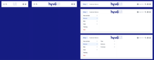
3. Vertical dropout 4 column
3. Footers
Hyvä releases three versions of footers:
1) Clean 2) 4-column newsletter 3) Mega
Merchants enjoy an extensive array of options, tailoring the content shared with customers based on their preferences for information volume. The mobile versions are particularly striking, delivering an incredible visual experience.

1. Clean
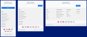
2. 4 Column Newsletter
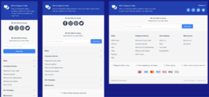
3. Mega
4. Product Listing Page (PLP)
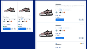
Adding this to the UI options is a significant enhancement, especially considering the complexity and costliness of applying such features to a standard Lume theme store. The inclusion of size and color swatches alongside the add-to-cart functionality truly sets this apart.
The image below illustrates how these features appear across different device types.
5. Product Category Page (PCP)
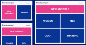
High-level category pages play a crucial role in extensive catalogs and are beneficial even for smaller to medium-sized ones, particularly when focusing on visuals. Generally, consumers tend to shop in three primary ways
1) Menu browsing 2) Search browsing 3) Landing Page browsing
Clear pathways provided by category pages simplify the customer experience, allowing for visual browsing ease upon landing on a page. These pages also contribute to accessibility considerations.
Hyvä offers two versions: Grid images and Grid patterns, providing distinct visual options for users.
Grid images
Grid Patterns
6. Generic Content
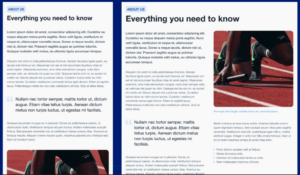
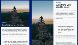
Streamlined, user-friendly, and legible content blocks simplify the consumer experience. Hyvä offers two versions, Text and Visual, designed for swift development, facilitating rapid modifications and offering a variety of choices.
Text
Visual
7. Attention grabbers
Hyvä UI presents eight attention-grabbing elements, spanning from Cookie banners to Notifications, providing a diverse toolkit for your store.
This versatility streamlines development efforts, allowing merchants to select the most fitting options for their specific requirements, thereby saving both time and money. Among these, the Newsletter title options and Modal choices stand out for their robust features.
The images below showcase the Modal components and Cookie elements across various device types.
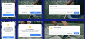
Modal

Cookie banners
8. CTA
Effective call-to-action (CTA) elements serve as vital guides across any ecommerce platform, directing users from homepage content blocks to enticing offers within the mega menu. They act as essential signposts, steering consumers to the right destinations.
Hyvä offers three distinct CTA components, each designed to enhance engagement and facilitate seamless navigation.

1. Image

2. Text only

3. Split
Conclusion
Hyvä UI’s latest release, following its 1.0 debut, brings an array of enhancements catering to user feedback. With new Figma designs available in the community, 13 additional components for Theme customers, and refined features like customizable galleries and improved navigation tools, this update showcases Hyvä’s dedication to user satisfaction and streamlined usability.
Hyvä UI is a powerful toolkit tailored for Hyvä Themes in Magento 2 stores. It’s packed with meticulously designed components like headers, menus, banners, and more, fulfilling user requests for customizable galleries and enhanced product details. The addition of Figma designs makes customization a breeze. As a complimentary offering for Theme license holders, Hyvä UI stands as an efficient, continuously improving solution for crafting visually captivating online stores.

About Author
Pankaj Sakariya - Delivery Manager
Pankaj is a results-driven professional with a track record of successfully managing high-impact projects. His ability to balance client expectations with operational excellence makes him an invaluable asset. Pankaj is committed to ensuring smooth delivery and exceeding client expectations, with a strong focus on quality and team collaboration.
